Additional Portfolio Pieces Available on Request
Several projects in my portfolio are restricted and cannot be shown publicly. In those instances, a high-level summary is provided on my Private Case Studies page, with full case studies available via a password-protected link for recruiters and hiring managers.
Portfolio Projects
Designed an app to help users and caregivers manage medications, with a focus on accessibility.
Conducted interviews, usability tests, personas, and a competitive audit to identify opportunities for a new pill reminder app.
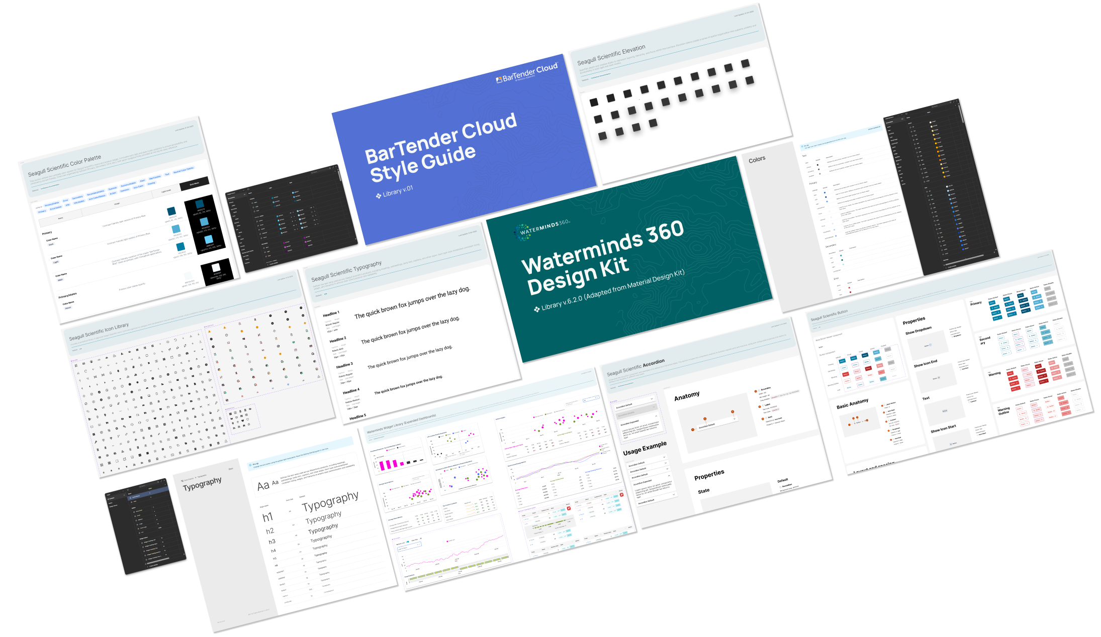
Redesigned the iconography of BarTender Cloud, Seagull Scientific’s cloud-based printing and labeling solution.
Standardized design templates, optimized workflows, and centralized inventory to improve marketing efficiency and brand consistency.
Simplified DOCS Education’s site navigation to reduce clicks and streamline the customer journey.
Designed promotional materials and animated banners to highlight course and equipment sales during seminars.
Produced quarterly DOCS Education magazines featuring articles, case studies, seminar promotions, and sponsor ads.
Designed a secure, visually engaging client survey to capture investment preferences and generate actionable analytics.
Redesigned a corporate site to declutter navigation, align with new branding, and integrate with Microsoft Dynamics CRM for lead tracking.
Built a branded suite of marketing and educational materials for Threshold Group associates to use with clients and prospects.
Developed campaigns to boost customer engagement and awareness of Puget Sound Energy’s energy efficiency programs and rebates.
Designed Seattle7Writers’ website and supporting print collateral to drive awareness and publicity.
Designed printed concert programs to promote attendance, encourage donations, and grow subscriptions.
Built a streamlined newsletter template for ‘The Voice of myPSE’ to enforce guidelines, reduce revisions, and speed production.


