Additional Portfolio Pieces Available on Request
Several projects in my portfolio are restricted and cannot be shown publicly. In those instances, a high-level summary is provided on my Private Case Studies page, with full case studies available via a password-protected link for recruiters and hiring managers.

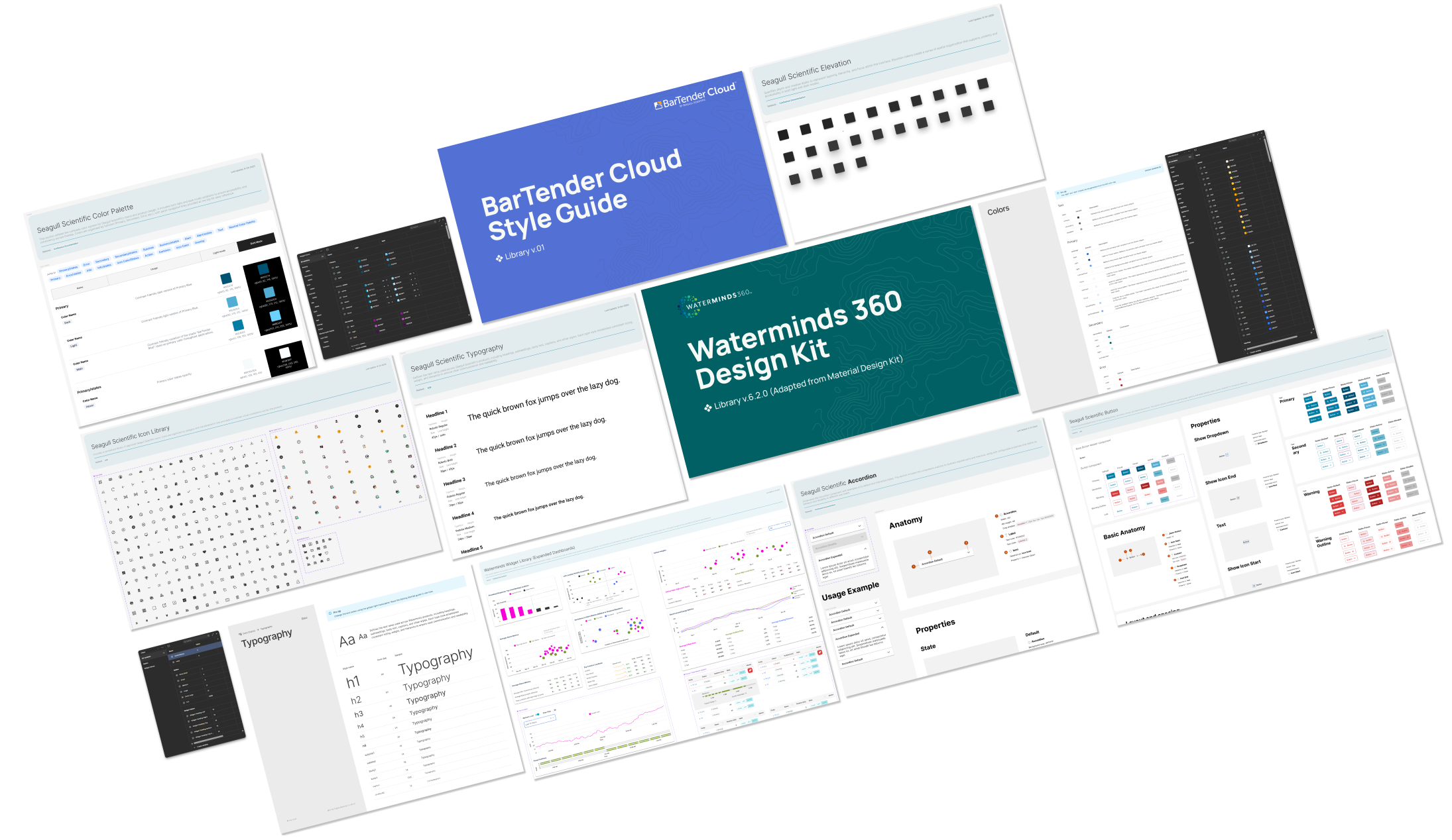
Figma Style Guides: Building & Maintenance
Created scalable Figma style guides for consistency and collaboration

PillBug Pill Reminder App – UX Case Study
Designed an app to help users and caregivers manage medications, with a focus on accessibility.

BarTender Cloud Navigation Redesign
Redesigning BarTender Cloud’s navigation for better usability

PillBug Pill Reminder - User Research & Competitive Audit
Conducted interviews, usability tests, personas, and a competitive audit to identify opportunities for a new pill reminder app.
BarTender Cloud Iconography Redesign
Redesigned the iconography of BarTender Cloud, Seagull Scientific’s cloud-based printing and labeling solution.

DOCS Education User Experience
Simplified DOCS Education’s site navigation to reduce clicks and streamline the customer journey.

Impact Investing Survey
Designed a secure, visually engaging client survey to capture investment preferences and generate actionable analytics.

Threshold Group Website
Redesigned a corporate site to declutter navigation, align with new branding, and integrate with Microsoft Dynamics CRM for lead tracking.
