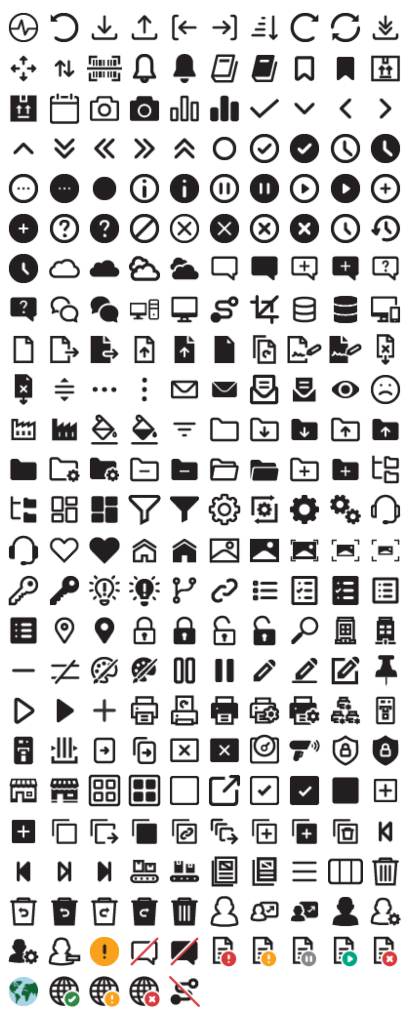
BarTender Cloud Iconography Redesign
This case study focuses on redesigning the iconography of BarTender Cloud, the cloud-based offering from Seagull Scientific – a leading provider of printing and labeling solutions.
Background:
Iconography Style Guide - Icon Creation
Seagull Scientific needed to revamp the iconography of their on-prem software when they added a new cloud-based software. The existing icons were outdated, lacked consistency, and failed to effectively communicate their respective functions. Users reported confusion and difficulty in navigating the software, resulting in decreased productivity and satisfaction.
Goals:
Improve Usability: Redesign icons to enhance clarity and intuitiveness, making it easier for users to understand and interact with the software.
Enhance Consistency: Establish a unified visual language for icons to promote consistency across the platform and improve overall aesthetics.
Ensure Accessibility: Ensure that the redesigned icons are accessible to all users, including those with visual impairments, by adhering to accessibility guidelines.
Maintain Brand Identity: Retain elements of the brand identity while modernizing the iconography to align with current design trends and user expectations.
Eliminate Unnecessary Costs: Remove reliance on subscription-based iconography provider ‘Font Awesome’
Iconography Style Guide - Color Guide
Research and Analysis:
Conducted user interviews, surveys, and usability tests to gather insights into current pain points and user preferences.
Collaborated with subject matter experts to ensure the icons properly conveyed the intended functionality.
Analyzed competitors' iconography to identify best practices and areas for improvement.
Reviewed accessibility guidelines to ensure compliance with relevant standards such as WCAG (Web Content Accessibility Guidelines).
Design Process:
Icon Audit: Conducted a comprehensive audit of existing icons to identify redundant or unclear symbols. The final count was estimated at roughly 220 necessary icons.
Wireframing: Created wireframes to explore different layouts and arrangements of icons within the software interface.
Concept Development: Developed several design concepts, focusing on simplicity, clarity, and scalability.
Iterative Design: Solicited feedback from stakeholders and users at each iteration to refine the designs and address any concerns.
Accessibility Considerations: Ensured that the redesigned icons incorporated clear shapes, sufficient contrast, and appropriate sizing to improve accessibility.
Iconography Style Guide: Created a style guide outlining the design principles, specifications, and usage guidelines for the new icons to maintain consistency across the platform. Documentation was provided on Confluence and communicated to the Development teams.
Implementation:
Collaborated with developers to seamlessly integrate the redesigned icons into the software.
Worked with the Technical Writing team to provide documentation to familiarize users with the new iconography and its functionalities.
Monitored user feedback to measure the impact of the redesign on usability and user satisfaction.
Results:
Improved Usability: Users reported a significant improvement in navigation and task completion, leading to increased productivity.
Enhanced Consistency: The redesigned icons contributed to a more cohesive and visually appealing interface, strengthening the overall brand image.
Accessibility Compliance: The new icons met accessibility standards, ensuring a more inclusive user experience for all users.
Positive Reception: User feedback indicated high satisfaction with the redesigned iconography, with many users praising its clarity and modern aesthetic.
Eliminated Subscription Reliance: Every Font Awesome icon was removed from the product and replaced with custom iconography.
Decreased Development Time: By utilizing SVG files and an icon style guide, icons were able to be scaled, edited, and implemented into the software much more efficiently.
Conclusion:
By prioritizing usability, consistency, and accessibility, the redesign of the iconography for BarTender Cloud not only improved the user experience but also contributed to the platform's overall success and adoption. Continual monitoring and iteration based on user feedback will remain essential to ensuring the long-term effectiveness of the redesigned iconography.

