Figma Style Guides: Building & Maintenance
Timeline: 2 years (Seagull Scientific, BarTender Cloud) and 6 months (Inframark, Waterminds)
Tools: Figma (Auto-layout, constraints, variants, color tokens)
Collaborated With: Designers, Engineers, Product Managers
Key Outcome: Developed living, scalable Figma style guides that standardized components, typography, and color usage across multiple products.
Business Impact: Accelerated sprint delivery, improved product scalability, and reduced UI build times by providing engineering with a single, highly organized source of truth for component specifications.

Overview
Establishing and maintaining consistent design systems is critical for usability, brand alignment, and cross-team collaboration. At both Inframark (Waterminds) and Seagull Scientific (BarTender Cloud), I created and refined Figma style guides that served as the foundation for scalable design practices.
Problem
Both organizations faced fragmented design systems. Inconsistent UI components, duplicated efforts, and unclear specifications slowed delivery and introduced unnecessary friction between design and development. Without a single source of truth, teams often had to reinvent solutions, leading to wasted time and uneven user experiences.
Objective
Develop a living Figma style guide that:
Standardizes components, typography, and color usage
Improves accessibility and usability across interfaces
Streamlines design-to-development handoff
Provides scalability for future features and iterations
Strengthens collaboration across design, product, and engineering
Process
1. Audit & Discovery
Reviewed existing UI patterns and gathered team feedback
Identified inconsistencies and redundancies in design assets
2. Component Standardization
Built atomic, reusable components in Figma with clear naming conventions
Applied auto-layout, constraints, and variants for flexibility
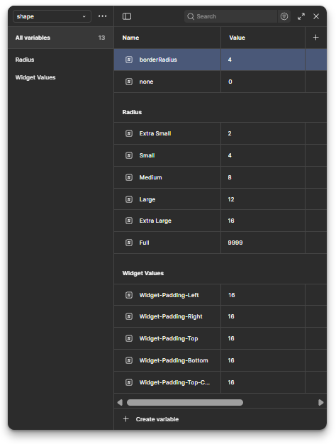
3. Tokenization & Theming
Established color tokens and type scales, tested for accessibility
Defined spacing rules and hierarchy to ensure predictable layouts
4. Documentation & Guidelines
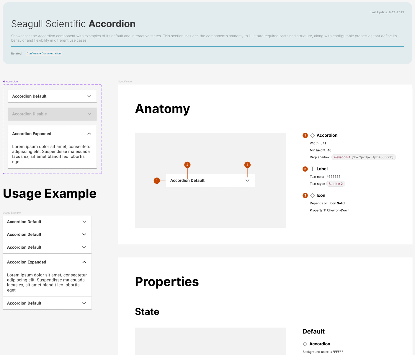
Embedded usage notes directly in Figma files
Created annotated examples of correct vs. incorrect use
5. Collaboration & Iteration
Partnered with engineering teams in weekly design-dev syncs
Leveraged Figma Inspect panel + code snippets for cleaner handoff
Integrated developer feedback to refine and expand the system

Seagull Scientific (BarTender Cloud)
Unified iconography, navigation, and UI component library
Conducted workshops with designers and engineers for alignment
Provided engineering with a single source of truth for specifications
Accelerated sprint delivery and improved product scalability
BarTender Cloud’s redesign required harmonizing iconography, navigation, and UI components across a product that had grown unevenly over time. The style guide not only provided clarity for designers but also gave engineers a single source of truth for component behavior and specifications. I facilitated workshops with both teams to walk through the system, answer questions, and adjust based on implementation needs. This reduced friction, improved delivery speed, and laid the groundwork for scaling the product with consistency.


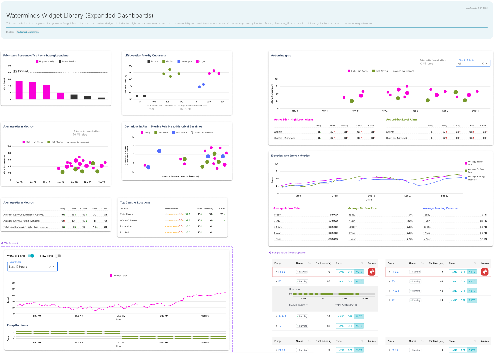
Inframark (Waterminds 360)
Created standardized widget and dashboard designs for complex data monitoring
Ensured critical sensor and pump data was consistently surfaced
Collaborated with engineering to mirror components in React
Reduced dashboard build times and minimized errors in translation
For Waterminds, the complexity came from data-heavy dashboards. Operators needed to monitor hundreds of pumps, filters, and sensors across multiple facilities. The style guide standardized widget design and visual hierarchies so critical data would always be surfaced consistently, no matter the dashboard. By partnering closely with the engineering team, I ensured components mirrored their implementation in React, reducing the time needed to spin up new monitoring layouts and minimizing errors in translation.
Due to Waterminds still being in active development at Inframark, not all design artifacts and screenshots can be shared publicly. Additional samples and detailed walkthroughs can be made available upon request in a private setting.


Ongoing Upkeep
I treated each style guide as a living system. When new design needs arose, I evaluated whether to extend existing components or create new ones, always documenting changes to keep the guide reliable. I also worked with product owners and developers to ensure updates were communicated and aligned with sprint priorities.
Outcomes
Reduced design inconsistencies and rework across multiple teams.
Improved design-to-development handoff, decreasing engineering time spent clarifying specifications.
Created scalable systems that continue to support new features and future iterations.
Strengthened collaboration between UX and engineering by providing a shared framework and vocabulary.
Lessons Learned
A design system is only as good as its adoption rate. Conducting workshops with design and engineering teams was critical to ensure alignment, gather feedback, and create a seamless design-to-development handoff.